Responsive Web Design:
Responsive web design is an approach for creating websites that give different viewing experience on different types of devices. This devices can be a desktop computer or a tablet or a mobile. Responsive web design is based on the following four elements:
- HTML5: Refers to the latest version of HTML, which was released in October 2009. HTML5 introduces a number of new features, such as new elements and attributes, Modernizr, Accessible Rich Internet Applications (ARIA) accessibility, and multimedia, which allow you to create more interactive Web applications and websites. Some of these elements and attributes are newly introduced, while some are enhancements to the existing ones.
- CSS3: Refers to the latest version of CSS. It has been under development since December 15, 2005. CSS is a style sheet language used for describing the appearance and formatting of a web document written in a markup language. CSS enables you to keep the instructions related to the presentation of Web content separated from the Web content itself. For instance, you can specify an image on a Web page with the help of an HTML element and specify the position of the image with the help of CSS code. The instructions related to the presentation of Web content can be described in a separate CSS document known as CSS style sheet. This separation provides improved content accessibility, flexibility and style sharing for websites. A CSS consists of a list of rules, which in turn consists of one or more selectors and a declaration block. Selectors are used to declare the markup elements to which a style is applied, while a declaration block consists of a list of declarations in braces. CSS3 provides support for border radius and image, box and text shadows, box-sizing, opacity, multiple backgrounds, and multi-column layout.
- Media Query: Signifies a combination of a media type and a condition that tells how a Web page should appear on a particular device.
- Design: Includes designs considering the smallest to larger viewports or screen sizes for different devices.
Media Query:
Media Query is a combination of a media type and an expression that tells how a Web page would be appear on a particular device. The expression is in the form of a condition that limits the style sheets scope by using media features, such as width, height and color. The concept of media queries is added in CSS3 for presenting the content on the basis of a specific range of output devices without changing the content itself.
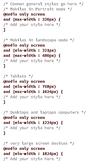
Example of media query:
Code:
Output:


 and 4 others joined a min ago.
 teamques10
★ 70k
teamques10
★ 70k